|
The new owners of Chinatown Takeout contacted us, having bought an existing Chinese restaurant and renamed it, and looking for a whole new image. Something upscale, classy, as close to a cafe as you can get-- being a Chinese takeout place.
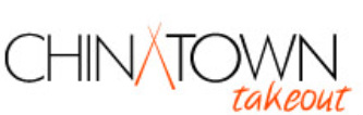
After a number of logos were presented to the client, two were chosen. Elements of each logo were used to create this final logo. It says 'Chinese food' without screaming it. It is clean and classy, with a casual touch. Black and orange were chosen, classy, yet bold. |

|
Here is an image of the back-lit sign we created for the outside of the restaurant.
|

|
This is their business card, created using the logo and its color scheme.
|

Here is the cover of the menu.
|

This ad was placed in a local magazine
|

^ The client requested a design for polo shirts, to be worn by the employees.
|
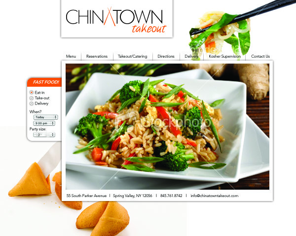
> This site was designed for the client, and liked, but was not used for technical reasons. We are proud of our work, and thought it was worth displaying regardless!
|
